Design with the user in mind
226 views · Published 2 July 2018 · 48:01 · Indexed 24 October 2026
Channel: Tableau · 2018 · Science & Technology
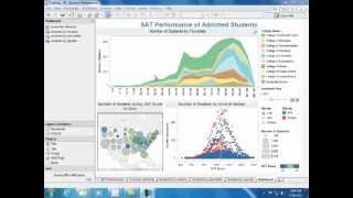
Balancing simplicity, functionality, and multiple views in a dashboard can be tricky—especially when you have a large amount of information to deliver. Knowing how to tailor design to your end user can make all the difference. In this session, we'll discuss story mapping tools and heuristics you can use to prioritize what belongs in your dashboard (and what doesn't). Bring the right level of interactivity and complexity to your dashboards, and take your design skills to the next level.
More from this channel
-
 6:07
Tableau and Dallas Cowboys Merchandise Management
-
 0:30
Tableau Fun - Dive at 5
-
 2:43
Equinox IT Finds Insight in Millions of Rows of Telco Data
-
 1:56
How Cheyne Capital Uses Tableau
-
 2:07
Understanding Admitted Students
-
 2:12
How DePaul Univesity Uses Tableau
-
 3:33
Viz Talk - Apple vs. Microsoft Stock Performance
-
 1:36
How Mercer Uses Tableau